Wednesday, 15 December 2010

Making My Poster.

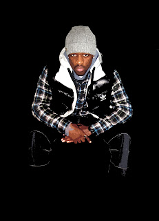
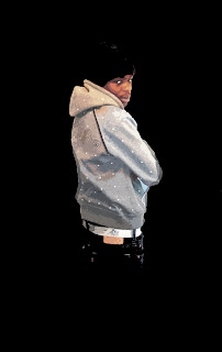
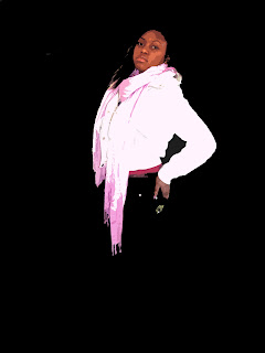
I used these main images of my actors on my poster. I used Photoshop, following the previous techniques to create the effect. I then used images from Google for a background (tower block silhouette) and other featured objects (the lamppost and brick wall). I then used fonts from a website previously presented (under websites used) to create the text for my poster.
Call Sheet.

I Used this call sheet to keep track of my actors, it had their contact details so I could easily get in touch with them when I needed them for filming, or pictures, Ect.

Tuesday, 14 December 2010

Fonts Used.


I looked at these fonts for my poster. I wanted to use some that were easy to read yet had an effect on the reader. In the end I only decided on using two. If I would have used to many fonts on my poster it would have looked messy and tacky.

Sunday, 5 December 2010

My Film Review Layout.

After looking at the layouts and language I know what i have to includ into my film review. I want to make my review informative just like my short film, but also keeping it enjoyable to read. I want it to have a very simple layout, being consistent with my poster and film. I'll use a simple layout, one that is neat and basic, few pictures and will have a simple background and text, which contrast from each other. Here are some layout ideas:

Monday, 29 November 2010

Step By Step Edit For Poster.

This is a step by step of how I want my images to come out, with the shadows blending with the background and the cartoon/posterize affect on the image. The first thing I did was open my image into Adobe Photoshop.

 
Under image, then adjustments, I clicked Contrast/Brightness. This allowed me to set the contrast higher, making the shadows and the edges of the image stand out. Whilst doing this I played with the brightness till it was at a brightness I thought was best to carry on editing my image with. The image then had bold shadows that were very defining.


After this, I used filter, then artistic, to find the setting cut out, I know from pervious editing that it makes the image look more comic. Once on this setting I changed the settings within this effect, which was the number of levels or edge simplicity, ECT.


After this I simply used the paint brush to colour all the background into black. All the white areas, and details in the background were then one simple colour, and it was like the person was creeping from a shadow, which is the affect I was aiming for.


Following this, I cropped the image to a suitable size. However I did fink that the colouring was not perfect, because the changes in contrast and brightness I had made, the colour was a bit off.


Therefore I went onto image, adjustments, and saturation and hue. He I was able to change the colour, EG make it more black and white, or make it green or purple. I changed the settings by reducing the hue and the saturation, till I found a colour that was most similar to the starting image.


And this was the final outcome. I will be using this effect for my poster. Going through these steps I know I need a clear background, either really pale white or a really dark one, I also know that I need a high quality image, which means using a good camera.

Changing Ideas.

Earlier I had to re-draw a storyboard and make a new script to go with it, this was because of weather conditions that wouldn't be good to film in. However I went out to re-film my short film, the weather was not bad so I was able to use my original storyboard and script.