Wednesday, 17 November 2010

Edit Samples.

For my poster I want it to be similar to the Kidulthood/Adulthood posters. I want all my characters to be shown under a dark shadow. However mine would be different because I might do the characters looking almost like comic book. I have fiffled around with photoshop and turned real images into cartoon/sketched ones.

I went on to photoshop and used filter > artistic > poster edge
Then I played with the contrast, making it high and the brightness of the image abit higher to.
I then went back onto filter > artistic > cut out
And here I played with the settings till it ended up like the above. I used an online tutorial to do this. Something like this could be ued on my poster. I would then want to cut the background and add shadows on to parts of the characters body.


I then went online to see if I could find another way to edit images, but quiker. The automatic settings would create it for me. I used google and typed in free online editing. I used:
I used the same image and edited it 5 time, using different effect, yet similar, all cartoon/sketchy effects. And these were the outcome.
                  Original Image:

Website Used.

This website is for an already made campaign to stop gun and knife crime. It was a very useful research point, I used it when doing the story line for my film, i wanted to make sure the message i was sending had facts and research behind it. The website gave loads of relevant facts about gun crime, knife crime and also joint enterprise. It also gave me ideas for my poster design, there were posters designed by both the community and the actual campaign crew. Looking at the posters that the public had created i could see what kind of poster would grab their attention and appeal to them.
This is a free font website. I used the fonts from this website on my poster and logo. Some of the fonts are very effective and i really liked them. Some suited my campaign perfect, such as ones that were scratchy or with dripping blood, these would represent the pain knife crime brings to people's lives.


I used this website to get free un-copy righted sounds for my film, such as the police sirens or slamming of doors. I didn’t take more than 5 sounds, however it was very useful in finding other sounds if they were needed.

I used this site to convert a YouTube video to an MP3. I wanted a specific sound from one of the campaign videos, it was only 20 seconds worth of sound, a stabbing noise and a knife is pushed in flesh. I couldn’t find a similar sound anywhere else other than this video.

Film Review Layout - Analysis.

Alice In Wonderland:
 The layout for this Alice in Wonderland review is very simple. There is a large image on the top half of the page goes across both pages, this image has all the characters from the film with very bold and bright colours. This of course represents the film; it is an adventure fantasy film for the family, both the children and adults. The valiant colours make the image stand out from the page, this grabs the reader to instantly look at this image, and they would then go on to read the text underneath it. There is no specific layout for the text it is just aligned to the left and is read normal like one page then the other. It then has the official release date and who the film is by (Disney).


Twilight:
The twilight layout is much different to the Alice in Wonderland layout. This double page spread starts with a catchy slogan as the header, it then has an image of a reel of film behind this. The layout of the text is in three columns, and is fixed around images that are placed in the review. There is a lot of text, which isn’t always a good thing; too much text can make a reader bored. However the use of a couple images does mean the review looks nicer and makes there seem like there isn’t as much text, which could encourage the reader to read. There are three relevant images from the film or about the film (the book) placed around the page, one to the far right and two smaller images to the left. The text is mainly written in the same black font, however some text (such has the header) is in a different font, and some words are in red. This cleverly keeps to the theme of the cover of the book, which is black, white and red.

Monday, 15 November 2010

Film Review Analysis.

This is the review for the new Harry Potter film. The reviewer first states the plot of the film, it is as short as possible and doesn’t give too much away whilst trying to explain the film and making it sound interesting. The reviewer then goes on to give the review, the writer starts it very dramatically, he grabs the reader with a very short sentence and a quote from the actually film. It then goes on to set the mood of the film, dark and eerie. The first tells a little about the film by comparing it to the previous Potter films, and how it is more dark and creepy, really setting the mood for those who wish to see this film. Throughout the review the writer uses a lot of humour; he tries to keep the review entertaining whilst giving his opinion. The reviewer also uses words from the film such as “muggles” and quotes the characters say in the film, this  gives more of a feel of the film before people actually watch it.

Sunday, 14 November 2010

Creating A Logo.


I used these images above to create my logo. Photoshop was the programme I used to create it as I was able to manipulate the images a lot. I changed the colours of both images and just rotated and overlapped them. It was simple to make as it was just two basic images. After this I was able to add text, just the letters; G,B,A, which was what my logo and film represented. A logo was made because it was a campaign, and campaigns often have logos which would represent them other than the film, and so viewers would know why the film and posters are around.


Monday, 8 November 2010

Logo Ideas.

Looking at other campaign logos I know that the logos have to be really simple, I was thinking about having hands all going to grab a knife, this could represent everyone contributing without actually holding the knife.
Here is an example of a cmapaign logo:

Here are some of my ideas:
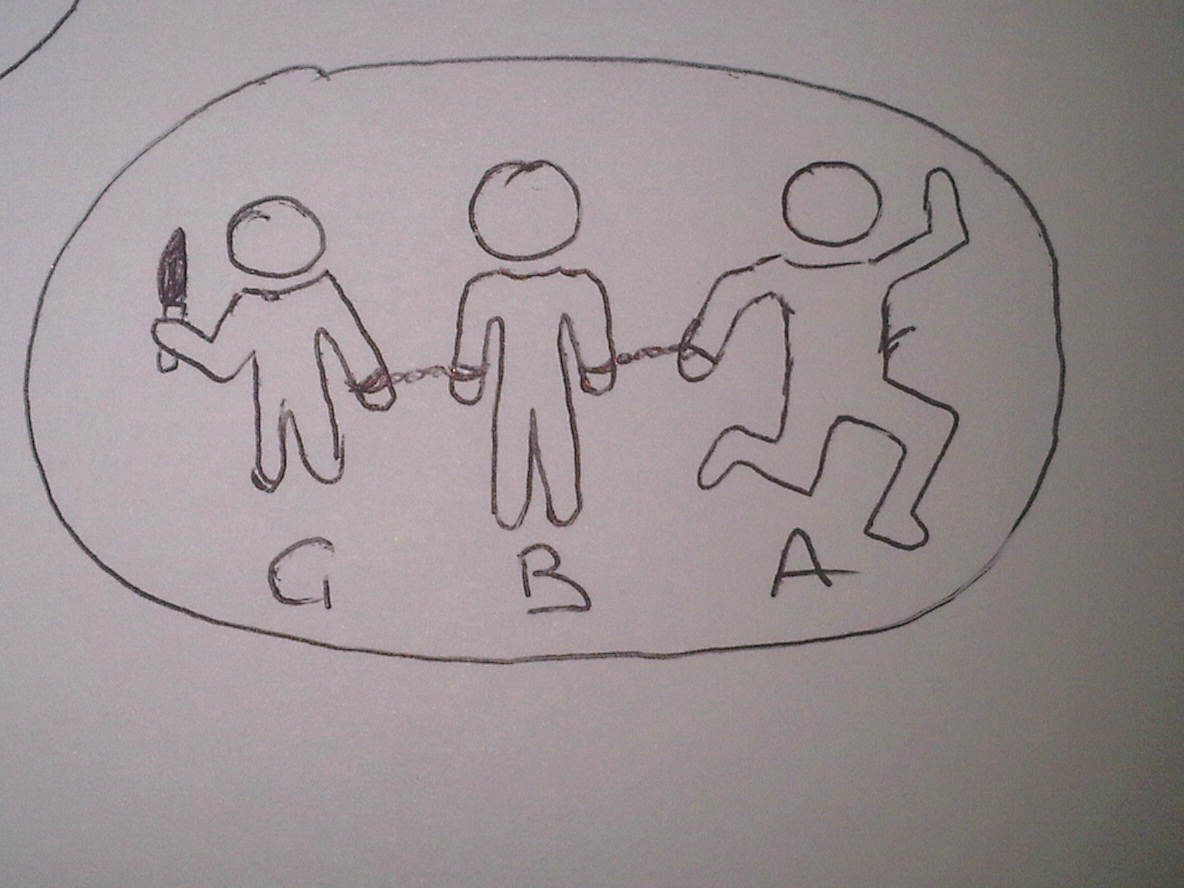
This shows people being joined by handcuffs. They are all guilty even though only one has a knife.
This shows two hands holding the knife, and it represents them both sharing the charge and guilt. It also may represent how some people feel forced into it, as it looks like one hand is forcing the other.
This one shows someone holding a knife and someone handcuffed to them. This represents that both or all people involed will share the sentance.

Poster Design.

For my film poster I have decided to give it the qualities of both a film poster and a campaign poster. Since my short film is a campaign I want to enforce this throughout my whole production, not just my film. Here are some ideas I drew up for my poster. Because campaign posters often use a strong image and few colours, rather than loads of images, backgrounds and colours, I wanted to incorporate this into my poster. However I did add things that a film poster would have such as the director, actors, film title, associations with the film, ECT.